Summary
I used altair to create 6 bar charts and concat them horizontally. However, the chart groups went over and overlap with the next chart. I tried a few methods to reduce the size of the bar charts, but only the encode level config works and it doesn’t give me the perfect size. Is there a way to let 6 bar chart auto-fit the width of the “column” it is assigned as a single chart?
Steps to reproduce
Code snippet: (a sample of my code, not reproductable)
    lines1 = alt.Chart(df_allratings,
                       title=alt.Title(
                           'Avg. Ratings by Tenure', anchor='middle')).mark_bar().encode(


        x=alt.X('Reviewer Tenure', title='Work Life'  ),
        y=alt.Y('mean(Work Life Rating):Q',scale=alt.Scale(domain=[2.5, 5]) ,axis=alt.Axis(grid=False)),
        color=alt.Color('Reviewer Tenure:N'
                        )

    ).properties(width=40)


    lines2 = alt.Chart(df_allratings
                       ).mark_bar().encode(
        x=alt.X('Reviewer Tenure',title='Culture Values'),
        y=alt.Y('mean(Culture Value Rating):Q',scale=alt.Scale(domain=[2.5, 5]),axis=None),
        color=alt.Color('Reviewer Tenure:N',legend=None)
    ).properties(width=40)

    lines3 = alt.Chart(df_allratings
                       ).mark_bar().encode(
        x=alt.X('Reviewer Tenure',title='Career Opp'),
        y=alt.Y('mean(Career Opportunity Rating):Q', scale=alt.Scale(domain=[2.5, 5]),axis=None),
        color=alt.Color('Reviewer Tenure:N', legend=None)
    ).properties(width=40)

    lines4 = alt.Chart(df_allratings
                       ).mark_bar().encode(
        x=alt.X('Reviewer Tenure',title='Compa Benefit'),
        y=alt.Y('mean(Compensation Benefit Rating):Q', scale=alt.Scale(domain=[2.5, 5]),axis=None),
        color=alt.Color('Reviewer Tenure:N', legend=None)
    ).properties(width=40)

    lines5 = alt.Chart(df_allratings
                       ).mark_bar().encode(
        x=alt.X('Reviewer Tenure',title='Senior Leader'),
        y=alt.Y('mean(Senior Leader Rating):Q', scale=alt.Scale(domain=[2.5, 5]),axis=None),
        color=alt.Color('Reviewer Tenure:N', legend=None)
    ).properties(width=40)

    lines6 = alt.Chart(df_allratings
                       ).mark_bar().encode(
        x=alt.X('Reviewer Tenure',title='I&D'),
        y=alt.Y('mean(I&D Rating):Q', scale=alt.Scale(domain=[2.5, 5]),axis=None),
        color=alt.Color('Reviewer Tenure:N', legend=None)
    ).properties(width=40)
    all=(lines1 | lines2 | lines3 | lines4 | lines5 | lines6)
    st.altair_chart(all, use_container_width=True)
As you can see, the width=40 doesn’t give me exactly what I want. Here is how it looks in the app:
See how it’s been overlapping with the heatmap on the right side?
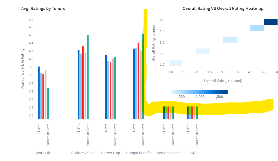
Ideally I wish to have the concat charts auto-size just like a single chart, not going over to the other charts.
Any suggestions are appreciated.