Hi Streamlit Community! ![]()
We all love the simplicity of st.metric, but sometimes our dashboards need that extra bit of visual flair or specific branding that the native components just can’t provide.
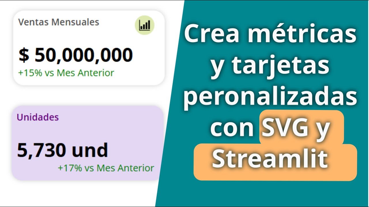
I wanted to share a tutorial I created on how to design and implement custom SVG metrics and cards in Streamlit. This technique allows you to create pixel-perfect, responsive designs using tools like Inkscape and then dynamically inject data into them using Python.
While I originally recorded this tutorial in Spanish, I’m excited to share that it utilizes YouTube’s AI dubbing feature. This means you can watch and listen to the full tutorial in English! It’s a great example of how we can share coding knowledge across language barriers.
 What you’ll learn:
-
Design: Creating flexible SVG templates using free tools like Inkscape.
-
Integration: How to treat SVGs as text files in Python to dynamically replace values, like colors and texts.
-
Responsiveness: Using
st.containerand CSS tricks to ensure your custom graphics resize perfectly on different screens. -
Logic: Changing metric colors dynamically (e.g., red for negative, green for positive) directly within the SVG code.
 Resources
 Video Tutorial:
 GitHub Repository: GitHub - gcastano/Streamlit-Demo-Apps
I hope this helps you create more stunning and personalized dashboards. I’d love to hear your thoughts or see what custom components you build with this method!
Happy coding! ![]()
