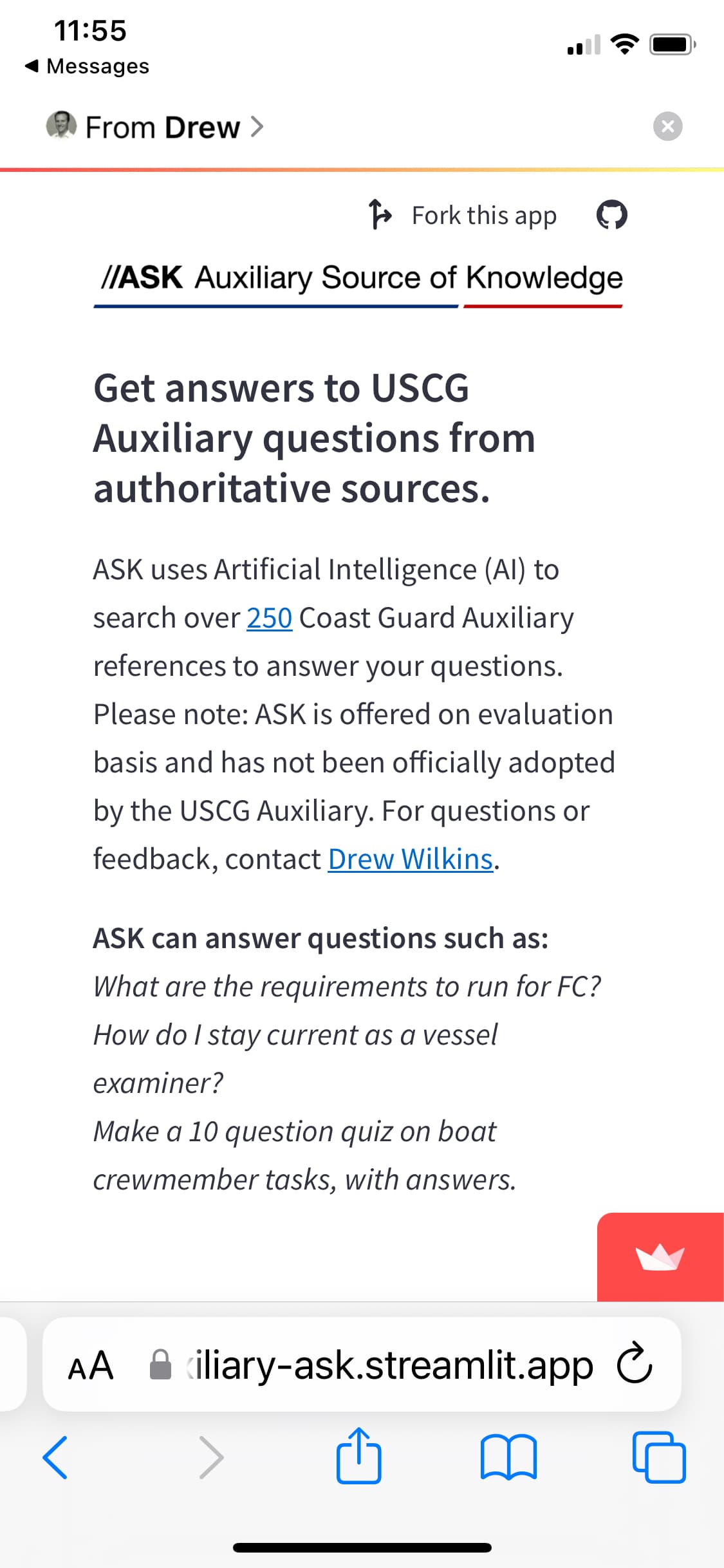
The placement of the Hosted by Streamlit overlaps the st.chat_input widget on an iphone.
issue is compounded by the fact that the Streamlit icon is large and red. So when it is clicked, which is inevitable, it takes the user away from the app to a Welcome to Streamlit page from which the back button no longer works to return to the app.
So the request is, at minimum, enable st._chat_input to be moved up above the fold.
The ideal solution from a usability standpoint is to ditch the logo of find a way to reduce it’s impact on the UX as others have suggested.
Responses below, but here’s my overarching comment: it would seem to me there is an underlying issue with how page height is being defined for the overall page, which affects every page on stramlit.io (not just the community cloud see below). This latent issue rises to the level of an acute usability issue when combined with the st.chat_input implementation.
First, to answer your questions:
I just put streamlit in my requirements file-- no version
Depending on the phone and browser, the chat input is either at the fold or below it, requiring you to know its there and scroll up, which a user doesn’t know to do and clicks the big red streamlit logo instead and then they are gone.
On some platforms the issue is worse. On iPhone 11 Pro iOS 16.5 Safari),there is no way to scroll down to the chat input at all, so the app is unusable.
I have heard from my users it’s an issue on ipad as well. Not sure what browser.
My Conclusions:
The underlying issue is with the overall html page or container. You can see the bahavior on every page on stramlit.io (see below). The problem becomes acute with st.chat_input implementation. My guess is that it is height settings on the html page or container. It forces a scroll no matter how short the page is (again see example from your documentation below). Then the problem comes to play because chat input seems to be pegged near the bottom of that master container and so gets pulled down below the fold. I’m not a css expert so don’t know the technical terms for these containers. Interestingly, the streamlit logo doesn’t suffer this same fate.
In my app the input box is completely hidden under the bottom of the screen and a user would have no idea it is there.
If you scroll up to cover the hamburger menu it is pretty well aligned so I wonder if this is more to do with the top spacing than the streamlit logo in the bottom?
Ideally, we’d have exactly control over the placement of the chat input box.