Hi all,
Looking at using a sidebar in my app to contain selectors that can then be collapsed and hidden to free up space for the rest of the dashboard.
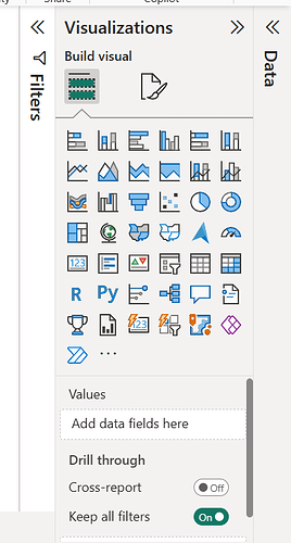
I want to know if there is a way to improve the visibility of the sidebar. I have seen posts on here that can alter the display of the collapsed arrow (How to make the collapsed sidebar on mobile more "visible"). However, I would like to do more. For example, is there a way to add some vertical text (similar to PowerBI - below), or some text associated with the arrow when it’s collapsed? I DON’T need multiple tabs, but good inspiration for the format!
Key info:
Not debugging, exploring options for using sidebar (open to other solutions too).
Deployed on another platform (but not live yet)
Python version 3.12, streamlit version 1.45.0
Thanks!

