Hi @rajat4493, welcome to the Streamlit community!
Don’t sell yourself short! Sharing is one of the hardest things to do in an open-source community, which is why so few people do it. So you’re already ahead of so many others
Are you going to share the code for this as well, or just the app?
I don’t have a whole lot to recommend right now, as I haven’t had time to play with it yet, but I did notice:
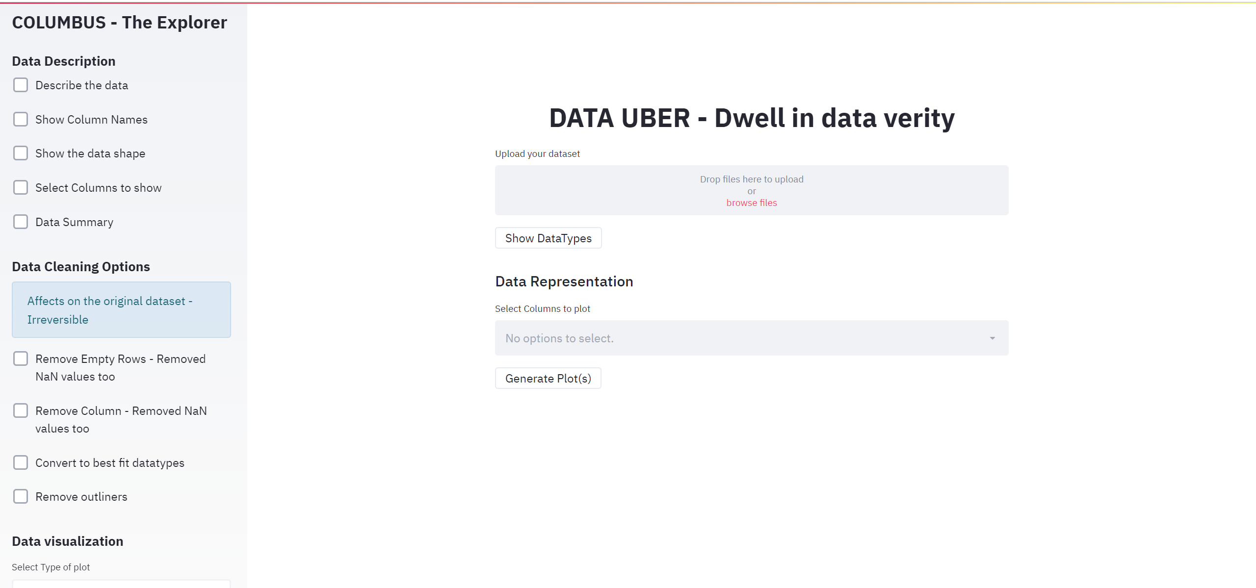
“outliners” can be replaced with “outliers”
“Affects on the original dataset - Irreversible” can probably be written “Modifies original dataset - Irreversible”
Wow no this does NOT look basic at all I can see there’s a lot of little Streamlit tips sprinkled in this app is the code accessible if we want to peek into this ?
I like the fact you chose to use a button to generate the chart on demand rather than rerendering it everytime you apply some cleaning. Though then I just generated a plot without having selected any column so I’d remove that button until a column is selected…
I was not sure whether the rendered graph took the cleaning step into consideration. I was expecting to see data disappear or colored removed by cleaning in red for example to show the change, or maybe some description of where exactly the cleaning occurs.
This is a fantastic app. My only suggestion add more visualization option. It will make the app even better.
Also Is the code available for public view?
Very good app. I also have a demo using i think the same code base as the original poster( code was gotten from a blog: https://blog.jcharistech.com/). The owner of the blog has very good streamlit apps with their code.
Thank you all for the encouragement and appreciation. I am working on fine-tuning the code and adding few more features. Will make it public after it’s done
@Naseb-HR - Thanks for that, even I was thinking the same. Will certainly look into it @fibo12 - Yes this is an amazing channel for reference, it did help me to start up.
 I can see there’s a lot of little Streamlit tips sprinkled in this app
  is the code accessible if we want to peek into this ?