Summary
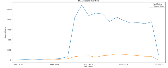
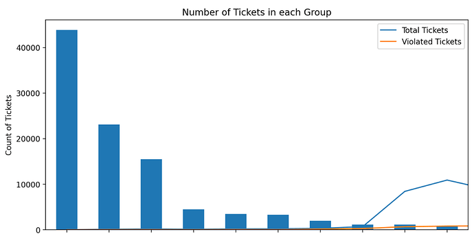
I am plotting two graphs with pandas.groupby.plot() and streamlit.pyplot(). The first graph is plotted correctly but the second graph is just the first graph duplicated and on top of it the second graph is plotted (merged into one)
Steps to reproduce
Code snippet:
# First Graph

fig1, ax1 = plt.subplots(figsize=(20,8))
full_count_time_series_plot = df.groupby(
				[df['Time_Series'].dt.year, df['Time_Series'].dt.month]
			).size().plot(kind='line', title='Number of Tickets Over Time', figsize=(20, 8), xlabel='(Year, Month)', ylabel='Count of Tickets', ax=ax1, legend=True, label='Total Tickets')
full_violation_count_time_series_plot = df.groupby(
				[df[df['Time_Taken'] < 0]['Time_Series'].dt.year, df[df['Time_Taken'] < 0]['Time_Series'].dt.month]
			).size().plot(kind='line', title='SLA Violations Over Time', figsize=(20,8), xlabel='(Year, Month)', ylabel='Count of Tickets', ax=ax1, legend=True, label='Violated Tickets')
st.pyplot(fig1)

# Second Graph
st.header('Frequency of Tickets - Type Wise')
type_var = st.selectbox("Select Any Categorical Column", df.columns, index=6)
top_plot = df[type_var].value_counts()[:10].plot(kind='bar', title=f'Number of Tickets in each {type_var}', figsize=(10, 5))
top_fig = top_plot.figure
st.pyplot(top_fig)
If applicable, please provide the steps we should take to reproduce the error or specified behavior.
Expected behavior:
First Graph (Correct)
Second Graph
Actual behavior:
First Graph (Correct)
Second Graph
The second graph has legend from the first graph and the both lines from the first graph (line chart)
Debug info
- Streamlit version: 1.20.0
- Python version: 3.9.13
- Using pip, venv
- OS version: Alma Linux 8
- Browser version: Chrome 111.0.5563.65
Requirements file
streamlit
pandas


