I am currently trying to display a heatmap for timeseries data using sns. I have created the pivot table using a multi-indexed dataframe and will select the axis based on the index labels. The problem is that the axis values do not show up. It instead shows the labels/names of the index rather than the actually values in the index. Below is a snippet:
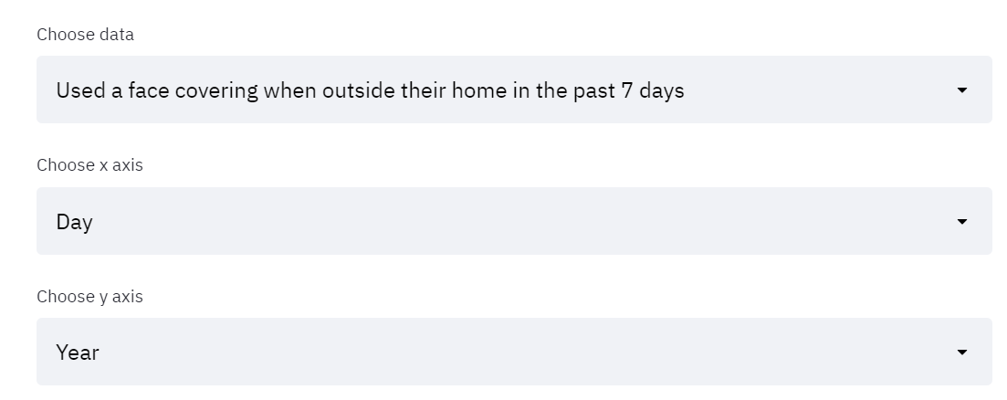
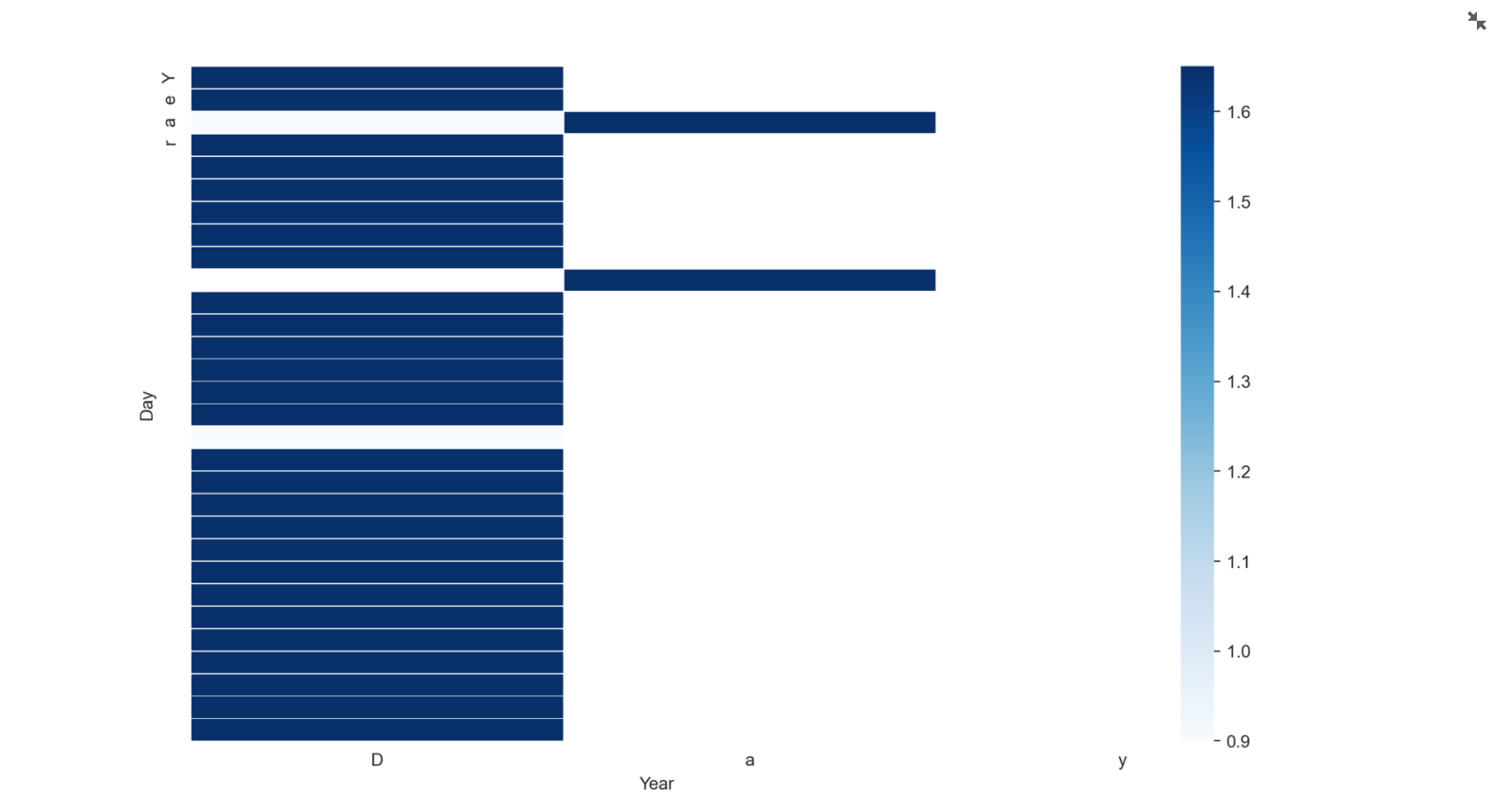
At the bottom, instead of the years showing, it shows the label ‘Day’. The same with the y-axis. Is there a remedy to this? My code is below:
> x_axis = st.selectbox("Choose x axis", options=Data_to_select_indexed.index.names)
> y_axis = st.selectbox("Choose y axis", options=Data_to_select_indexed.index.names)
>
> # Pivot table
>   Pivot_data = Data_to_select_indexed.pivot_table(index=x_axis,columns=y_axis,values=data_to_analyse)
>
>   f, ax2 = plt.subplots(figsize=(12, 7))
>   # show data
>   ax2 = sns.heatmap(Pivot_data, linecolor="white", yticklabels=y_axis, xticklabels=x_axis, cmap="Blues", vmin= 0.9, vmax=1.65, linewidth=0.3)
>  st.write(ax2)
> st.pyplot()
If I did not choose ‘.names’ in the select box, it comes up with all the numbers rather than the category assigned to the index. for example, if I chose:
'x_axis st.selectbox(“Choose y axis”, options=Data_to_select_indexed.index)
Then all the numbers representing the dates (month, year, day) would show up individually.
I also tried changing the x/y axis label names using the inbuilt seaborn function albeit to no success.
Is there a way to structure this so that the end result will look like this but in streamlit?

