Hi all,
I’m working on this application:
Streamlit
Here’s the Github:
boxcartenant/Notes_Organizer
If you decide to test the program, be aware it will make some folders on your google drive. But it only has scopes to access the files it creates, so you can just delete them after.
Here’s a screenshot of the thing I’m gonna ask about

And here’s the relevant code:
with st.form(key=form_key, clear_on_submit=True):
    col1, col2, col3, col4, col5, col6 = st.columns([1, 1, 1, 1, 2, 1])  # Added col6 for move button
    with col1:
        move_up = st.form_submit_button(f"⬆ {idx}", disabled=idx == 0, help = "Swap this block with the block above it")
    with col2:
        move_down = st.form_submit_button(f"⬇ {idx}", disabled=idx == len(blocks) - 1, help = "Swap this block with the block below it")
    with col3:
        delete = st.form_submit_button(f"🗑 {idx}", help = "Delete this block")
    with col4:
        merge = st.form_submit_button(f"🔗 {idx}", disabled=idx == len(blocks) - 1, help = "Merge this block with the block below it")
    with col5:
        chapters = list(st.session_state.project["manifest"]["chapters"].keys())
        target_chapter = st.selectbox(f"Move {idx}", ["Select a Chapter"] + chapters, key=f"move_select_{block['id']}", label_visibility="collapsed")
    with col6:
        move_to_chapter = st.form_submit_button("Move", help = "Move this block to the selected chapter")
The problem that I want to solve is: when I make the window narrow (e.g. on a phone), then all of the buttons arrange themselves vertically. I’ve also tried splitting them into two rows, so that they can all definitely fit horizontally on a phone, but it looks like phone-sized layouts will arrange the columns vertically no matter how small the columns are.
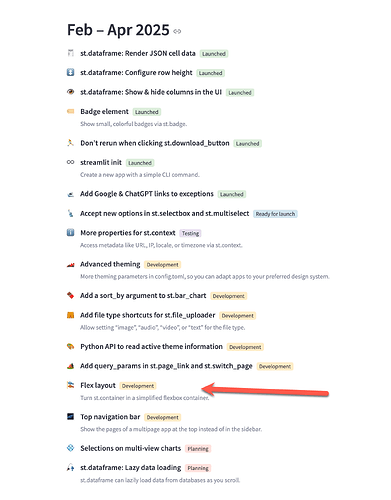
What I want is a way to make the row of buttons wrap to the next line if they run out of room.
Is it possible?
Thanks!
