Keeping grid of st.images all time 100% visible regardless browser window AR and size

Please take a moment to search the forum and documentation before posting a new topic.

well I tried to search but did not find anything on this forum, and generic Internet search seems to return non-working instructions. Maybe search keyword problem. So

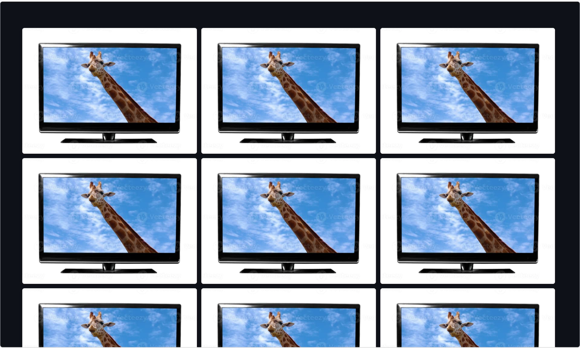
I have a grid of st.image (2x2 and 3x3). Done with top level st.container and then st.columns(2 or 3) and st.columns is repeated for required amount of rows.

import streamlit as st

st.set_page_config(layout="wide")

camcolumns=[]

with st.container() as cont:
    # generate grid dynamically
    for r in range(3):
        camcolumns.append(st.columns(3, border=False))
        
        for i, c in enumerate(camcolumns[r]):
            with c:
                camcolumns[r][i] = st.image("https://static.vecteezy.com/system/resources/previews/036/307/036/large_2x/tv-screen-with-picture-photo.jpg")


Now as I resize the window the images are scaled. If Aspect Ratio goes to too high the bottom part if images are clipped away. I need to keep 100% of images visible on screen/viewport. In CSS max-height=100% and max-width=100%.

In essence I must prepare show images on TV-screen without scrolling which is 16/9 either full-hd or 4k. And depending on images AR the might be clipped. As streamlit-app is full screen on TV and no remote, scrollbar must be disabled/non-existed.

Is there anyway to achieve this. Probably with CSS-tuning? As I am not a CSS expert I nor copilot are successful on doing that.

With this copilot code it partially works, but I lose the image full screen view. And maybe 16/9 aspect ratio is too fixed, as it should be calculated to actual screen or window aspect ratio.

# Inject CSS to constrain image height and preserve grid
st.markdown("""
    <style>
    .image-box {
        width: 100%;
        aspect-ratio: 16 / 9;
        max-height: 30vh;
        overflow: hidden;
    }
    .image-box img {
        width: 100%;
        height: 100%;
        object-fit: contain;
    }
    </style>
""", unsafe_allow_html=True)

# Image URL
img_url = "https://static.vecteezy.com/system/resources/previews/036/307/036/large_2x/tv-screen-with-picture-photo.jpg"

# Display 3x3 grid using st.columns
for _ in range(3):  # 3 rows
    cols = st.columns(3)  # 3 columns per row
    for col in cols:
        with col:
            st.markdown(f"""
                <div class="image-box">
                    <img src="{img_url}" />
                </div>
            """, unsafe_allow_html=True)

The most perfect solution is the simplest, this seems to do the job. However I would like to have more support from Streamlit side to allow this kind of functionality with dynamic screen size to set ‘max-height’ to proper value automatically.

st.markdown("""
    <style>
    img {
        max-height: 25vh;
        object-fit: contain;
    }
    </style>
""", unsafe_allow_html=True)

1 Like