New Component: 20+ Animated loaders, updated navbar and more from Hydralit Components

The new version of Hydralit Components is done. There have been a number of improvements and additions. You can see and play with the new features in the update Hydralit live demo.
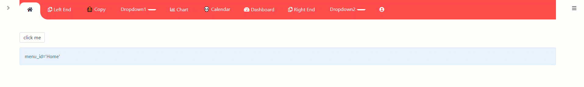
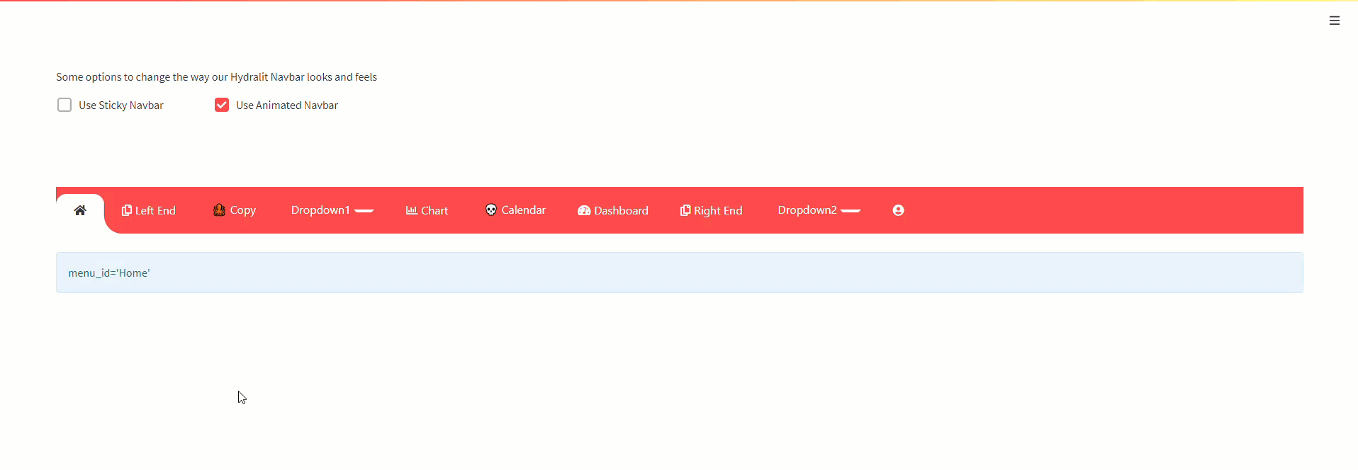
Navbar:

  • Tighter/smoother animation
  • Can toggle animation on/off
  • Ability to override the return value
  • Sticky navbar (still bounces, but that’s Streamlit problems)

HyLoader:

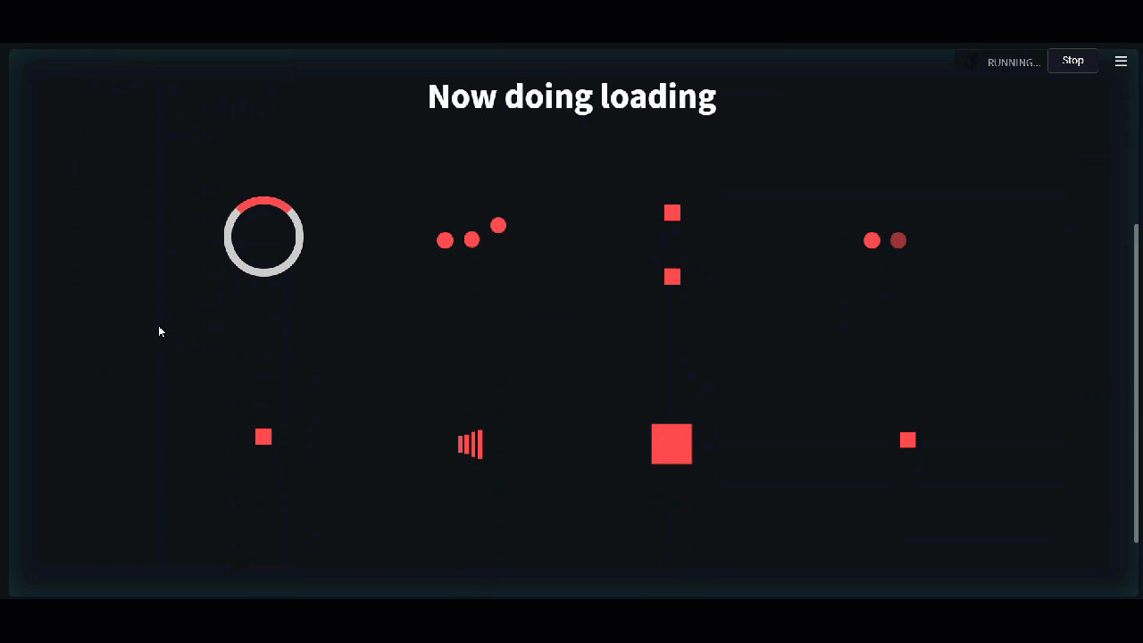
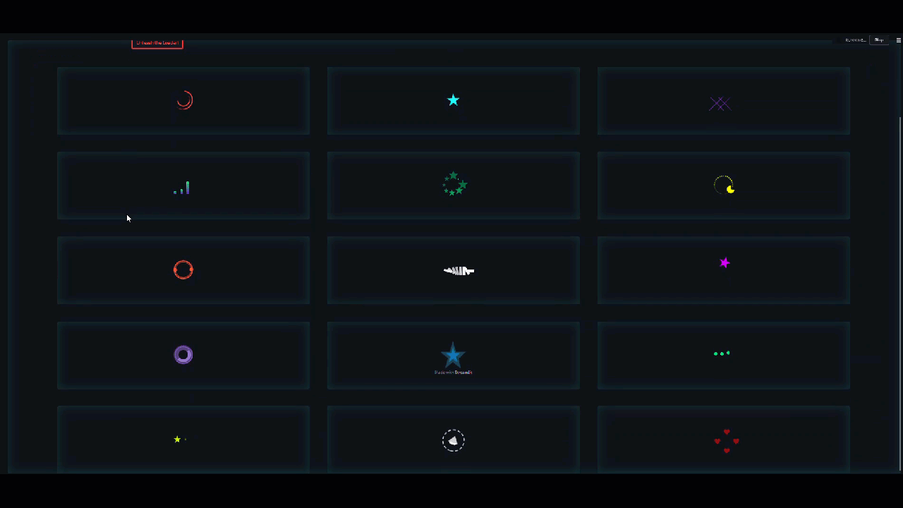
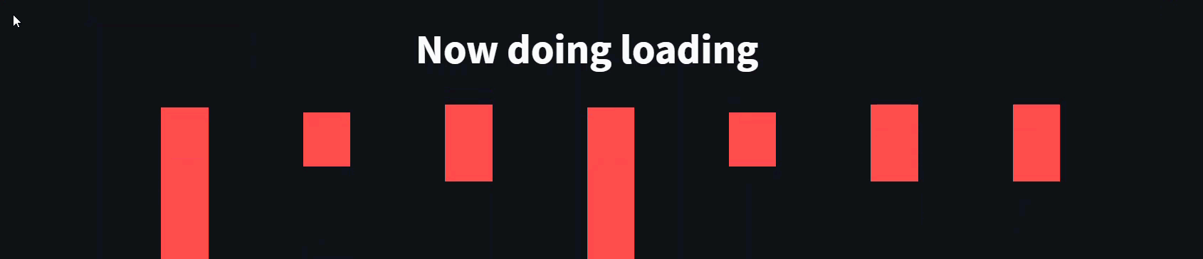
  • 20+ custom animated css based loaders
  • Can use 1, 2 or any number that comes from the same palette of loaders (the demo screens are just a grid of the entire palettes)
  • Auto loads theme colours
  • Use them the same as the spinner component and just wrap around your running code
  • Can add multiple or replicas
  • Add custom loading banner text
  • Creative, standard and pretty types are available
  • Any loader adds a halo around the entire application when running, so the entire page is embossed during loading

As simple as wrapping your code in the loader,

import hydralit_components as hc

# a dedicated single loader 
with hc.HyLoader('Now doing loading',hc.Loaders.pulse_bars,):
    time.sleep(loader_delay)

# for 3 loaders from the standard loader group
with hc.HyLoader('Now doing loading',hc.Loaders.standard_loaders,index=[3,0,5]):
    time.sleep(loader_delay)

# for 1 (index=5) from the standard loader group
with hc.HyLoader('Now doing loading',hc.Loaders.standard_loaders,index=5):
    time.sleep(loader_delay)

# for 4 replications of the same loader (index=2) from the standard loader group
with hc.HyLoader('Now doing loading',hc.Loaders.standard_loaders,index=[2,2,2,2]):
    time.sleep(loader_delay)

You can visit the live running Hydralit sample and checkout the Loader Playground to see what is possible.


And more!

Experimental:

  • Allows for the injection of custom Javascript and HTML directly into Streamlit
  • Can be turned on/off with a toggle

Remember, it’s called experimental for a reason.

There are alot more things in the new release, but I don’t have time to demo and document it all.

7 Likes

Nice component

That’s a very cool upgrade to the Hydralit library. Thanks for sharing and keep the awesome work @Probability!

Best,
Charly

Hi @Probability, thanks for these amazing components!

I’ve installed the last version and when I start my application, it shows these borders while the app is loading:

I changed the loader, but it still showing the borders. Is there any way to remove/disable them?

Thanks in advance!
Wilber

Thanks, those borders are part of the loader effect, they can’t be disabled as they are there to provide an indicator that the entire app is being loaded, which is essentially what happens during a rerun, think of it like the grey tint over the controls that Streamlit shows by default when performing a rerun. I’ll make a note to look at providing a toggle on the border effect in the next version.

1 Like

@Probability Thanks for this awesome component. I want to stick the Navbar on the top. So using the parameter navbar_sticky=True But while switching between tabs the Navbar is changing its position. Is there a way to keep the Navbar always on the top?

nav bar sticky

Thanks

@Probability It is possible to totally eliminate the loading animation (use standard streamlit loading)? I love your animations but in some dashboards they make the app a bit confusing when modifying multiple filters

Thanks, this is a known issue that will be fixed in the next release. whenever the script re-executes, the Streamlit “running” status message at the top of the page is what is pushing the navbar down. i do have a fix, albeit it will introduce a very small gap at the top, but the jumping will stop.

I can understand, it’s a matter of personal choice. There is an easy solution to customise the way the loader works by creating your own loader! it can simply do nothing and then you won’t see anything, or you can change it to use a Streamlit default, you can even check which app is being loaded and use a different one per app.

In the hydralit example repo, i use a custom loader to demonstrate how to detect the app and customise the experience. In hydralit there is a default loader, that is the one you’re seeing usually, you can replace it with your own as below to have any type of behaviour you want.

Since your using the add_app method, this is great, as you can just use the app.add_loader_app method, as show in the example.

The code for the custom loader in the example is located here, it has the same structure as the normal apps you add, with the exception that the run method accepts another argument, which is a reference to the app that is going to be loaded. As you can see, that app_target variable is a reference to the app that is being requested to run from the parent, you do anything you want, display anything, then call the run() method on that target app. In this case, you wrap the call app_target.run() with a custom loader or one of the info messages or something from Streamlit. Animation gone, so you get the look you’re after. If you want the loader for some apps and not others, just check the name of the app as per the example and you can customise it.

def run(self,app_target):

    try:
        app_title = ''
        if hasattr(app_target,'title'):
            app_title = app_target.title
        
        if app_title == 'Sequency Denoising':
            with HyLoader(se_loader_txt, loader_name=Loaders.pacman):
                time.sleep(int(self.delay))
                app_target.run()

        elif app_title == 'Loader Playground':
            app_target.run()
        else:
            with HyLoader("✨Now loading {}".format(app_title), loader_name=self._loader,index=[3,0,5]):
                time.sleep(int(self.delay))
                app_target.run()


    except Exception as e:
        st.image("./resources/failure.png",width=100,)
        st.error('An error has occurred, someone will be punished for your inconvenience, we humbly request you try again.')
        st.error('Error details: {}'.format(e))`

Hope that helps and thanks.

New in version 1.0.6 (navbar updates)

  • Changed the sticky behaviour (if you want it at the top, like Streamlit ordering, declare it first) NOTE: The sticky_nav parameter moves the navbar to the top of the window, use sticky_mode = 'sticky' or sticky_mode = 'pinned' if you want it to be sticky, but it will be jumpy or pinned and not jumpy. If you want the Streamlit hamburger menu to appear with the navbar use hide_streamlit_markers=False
  • Can co-exist with the Streamlit hamburger menu now, as well as the status indicators (running/stop…)
  • Improved the centering and appearance
  • Can toggle the Streamlit markers on/off independently of the sticky nav setting
  • Bug fix with initial value with label and id provided (Thanks Daveography!)

Navbar Modes
Pinned Mode

Sticky (jumpy) Mode

Regular Mode

This is well worth adding to the components registry. See NimbleBooks.com for an implementation relying heavily on hydralit.

1 Like

Thanks Fred, love your site by the way! :sunglasses:

Very nice component. I have a problem about hyloader. It looks very big in the page. Is there any possible way to make it smaller?

This topic was automatically closed 365 days after the last reply. New replies are no longer allowed.