Hi,
I’m getting a warning - I’ve looked at other threads but still can’t figure it out on my use case.
Here is my code in it’s entirety:
import pandas as pd

from causalimpact import CausalImpact

import streamlit as st

df = pd.DataFrame({'date': ['2021-01-01', '2021-01-02', '2021-01-03', '2021-01-04', '2021-01-05', '2021-01-06'],

                   'value': [1539, 1696, 1427, 1341, 1426, 1471]})

def get_pre_post(data, change):

    pre_start = min(data.index)

    pre_end = int(data[data['date'] == change].index.values)

    post_start = pre_end + 1

    post_end = max(data.index)

    pre_period = [pre_start, pre_end]

    post_period = [post_start, post_end]

    return pre_period, post_period

change = '2021-01-05'

pre_period, post_period = get_pre_post(df, change)

ci = CausalImpact(df.drop(['date'], axis=1), pre_period, post_period, prior_level_sd=None)

fig = ci.plot()

st.pyplot(fig)
Any help is much appreciated (I don’t want to just disable the warning)
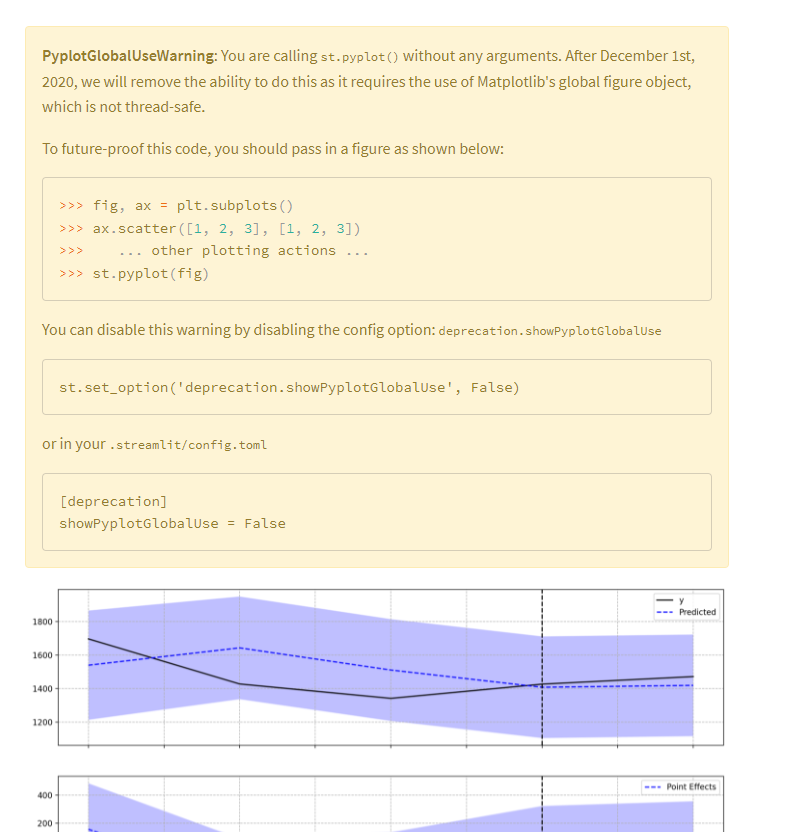
Hi @Grainger,
This was a tricky one to figure out. I inspected the plotting source code of the pycausalimpact package and found that the ci.plot() method does not return any object. Instead, it calls plt.show().
What needs to be done is to use matplotlib get the current figure and current axes created when ci.plot() is called, and pass the resulting figure to st.pyplot(). Here’s how to do it:
Solution
import pandas as pd
import matplotlib.pyplot as plt # required later
from causalimpact import CausalImpact

import streamlit as st

df = pd.DataFrame({'date': ['2021-01-01', '2021-01-02', '2021-01-03', '2021-01-04', '2021-01-05', '2021-01-06'],

                   'value': [1539, 1696, 1427, 1341, 1426, 1471]})

@st.experimental_memo
def get_pre_post(data, change):
    pre_start = min(data.index)
    pre_end = int(data[data['date'] == change].index.values)
    post_start = pre_end + 1
    post_end = max(data.index)
    pre_period = [pre_start, pre_end]
    post_period = [post_start, post_end]

    return pre_period, post_period

change = '2021-01-05'

pre_period, post_period = get_pre_post(df, change)

ci = CausalImpact(df.drop(['date'], axis=1), pre_period, post_period, prior_level_sd=None)

ci.plot()

fig = plt.gcf() # to get current figure
ax = plt.gca() # to get current axes

st.pyplot(fig)
Output
Happy Streamlit-ing! 
Snehan
Awesome - works perfect - thanks very much