So as part of my app I am currently building, I needed a custom notification/alert box with the functionality to close upon clicking. Sharing this with the community.
The above gif demonstrates its use with a button as a callback.
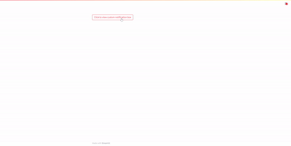
You have the possibility to change the icon, the text, the link is optional and the box can be closed by clicking the x button. The css can be changed via the style variable to create all kinds of alert boxes.
For more details, visit the repo page
Update
Version 0.0.3 sorts the issue @Shawn_Pereira indicated.
Update
Version 0.0.7 sorts the issue @Shawn_Pereira indicated.
Looks super nice!
Happy Streamlitin’,
Fanilo
Thanks and yeah will get these done later today.
Hi @Rushmore , the alert box is a very nice addition to the Streamlit set of user-created components. It looks good and is configurable too.
I just wish to check something with you:
I put your component into a function, which I ran from inside a widget callback. It showed only the first time (unlike with a regular st.error message, which showed up each time the callback was called). Maybe, I might be doing something wrong…
Cheers
Hey Shawn, that’s a good point. It does not show after the close button is hit unless the app is reloaded. Will look into it. Thanks
I think I figured the issue. Initially it was not returning any value because there was no need to - its just a notification box with the functionality to close it. But once its closed, it does not return anything. So instead I just made it return an empty string which solves the issue.
Hi Rushmore, after the re-install, I got 2 kinds of errors:
- On first run, I get a button with a label “Test 1”, which is not part of my code
- Almost always, on refresh, I get a component not ready message (as per attached pix, without the button)

The code I used was:
import streamlit as st
from streamlit_custom_notification_box import custom_notification_box as scnb
def AlertBox(wht_msg):
    styles = {'material-icons':{'color': '#FF0000'},
            'text-icon-link-close-container': {'box-shadow': '#3896de 0px 4px'},
            'notification-text': {'':''},
            'close-button':{'':''},
            'link':{'':''}}

    scnb(icon='info',
        textDisplay=wht_msg,
        externalLink='',
        url='#',
        styles=styles,
        key="foo")

AlertBox("test message...")
Maybe, it just requires a little tweaking.
Cheers
Hey mate, apologies, I forgot to deploy it with release True. All sorted now.
Hi @Rushmore , it works as intended - Perfect !
If I can be so bold as to nit-pick, may I offer a few suggestions?
The pix below has both the error feedback options: st.error & your component

Suggestions:
- That your component expands to the width of the container (in this case st.column), as it does with st.error
- Remove the blank gap above your component.
The st.error has a small vertical gap between the date widget and the st.error
Your component has a much larger gap
- Add a little extra (horizontal) space between the icon and the error feedback text
Otherwise, your component is super awesome. I have already introduced in my upcoming project (instead of st.error)
Thanks once again - your effort is very much appreciated.
Cheers
PS: Will test your prettier component too!
Hey Shawn, glad you like it. With regards to your suggestions:
- This is what the style parameter is for, so you can customise it according to your own specifications. If you look at the style.css file in the github page, you can make adjustments using the style variable. I don’t know what the best width is so I left it open for the user to determine themselves (try it out and see for yourself).
- This too can be adjusted from the styles variable.
- This too can be adjusted from the styles variable.
The user gets to customise all of this themselves.
Thanks again!
Glad I found this component, nice work!
It would be great if the top-level notification-icon-container css class was configurable, so I created a pull request to make it so @Rushmore! (see here).
Hopefully this helps 
Cheers.
Hey Ben, apologies for the late response, this has been sorted. Thanks for the spot!
Nice one! Thanks for that